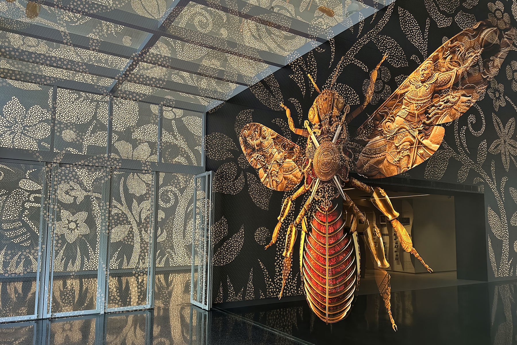
Australian Cricketers’ Association

Australian Cricketers’ Association Brand identity for The Australian Cricketers’ Association which is the collective and representative voice of past and present male and female elite domestic and international cricketers in Australia. Australian Cricketers’ Association Brand identity for The Australian Cricketers’ Association which is the collective and representative voice of past and present male and female […]
Greyhound Racing Victoria

Greyhound Racing Victoria The peak body for the regulation of all greyhound racing governs the sport within the State of Victoria. Repositioning this brand was never going to be about finding new things, but rather seeing what existed and finding new expressions of what was already well known by all the audiences they wished to […]
Melbourne Olympic Bid
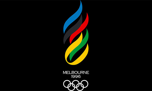
Melbourne Olympic Candidature Melbourne Olympic Bid When the city of Melbourne decided to bid for the 1996 Olympic Games, an intense, short-term communication programme was required as part of the bid formalities. It seemed appropriate that in the Centenary year of the games that the Olympic flame and Olympic colours became the foundation of the […]
Hawthorn Football Club
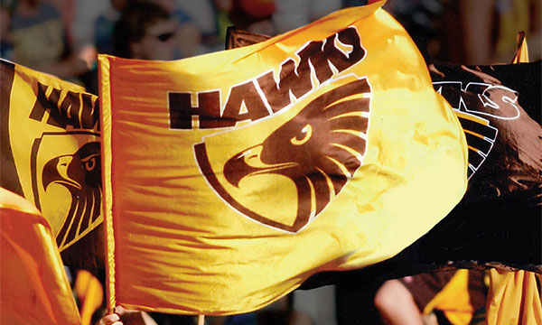
Hawthorn Football Club The sport of Australian Rules Football dominates the winter months in Australia. One of the competition’s most powerful teams undertook a programme to rejuvenate the traditional and much loved elements of their historic brands. The repurposed usage of the traditional brown and gold stripes combined with the steely eyed hawk reinforced the […]
Geelong Football Club

Geelong Football Club The Geelong AFL Team adopted, ‘footy full on’ as a way of thinking for a single brand that could be lived by all club stakeholders. Whatever the role, it could be delivered with extreme commitment, getting the best possible outcome. The iconic cat was redesigned to incorporate the memorable traditional blue and […]
La Comer

Controladora Comercial Mexicana, S.A.B. de C.V La Comer Since 1968, the well known pelican trademark has identified one of Mexico’s favourite brands. The La Comer supermarket chain undertook a brand refresh programme and, at its centre, was a strengthening of the main characteristics of its iconic pelican symbol. The pelican’s beak was often likened to […]
Alegra
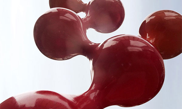
Neinver SA Alegra The Alegra Business, Commercial and Leisure Center (Parque Empresarial, Comercial y de Ocio Alegra) is a Spanish shopping centre covering over 300,000 square metres and, as the name suggests, caters to a wide variety of activities and prestigious tenants. In a further development phase, the already-established identity was extended to embrace many […]
Modoo

Alpha Real Captial Modoo Espacio Buenavista Shopping Mall is a unique building, spectacularly designed by the famous Spanish architect, Santiago Calatrava, located in the heart of Oviedo. From the beginning, the mall was sold as the great catwalk of fashion, but unfortunately failed to deliver this look and feel through the original identity. The centre […]
L’Aljub
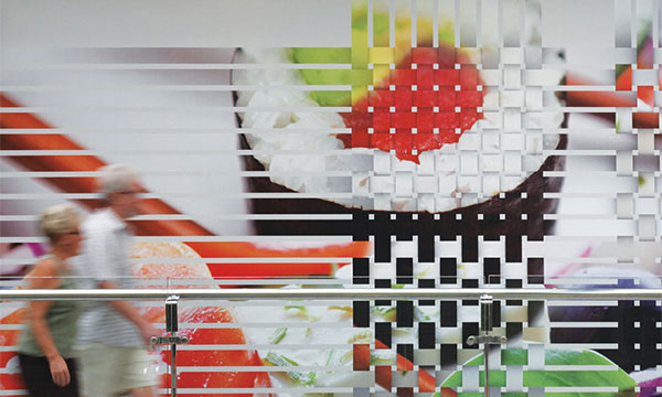
DWS Group L’Aljub A graphic interpretation of the interwoven date palm leaves of the trees surrounding the Spanish shopping centre provided inspiration for the character of the brand identity and built environment components. DWS Group L’Aljub A graphic interpretation of the interwoven date palm leaves of the trees surrounding the Spanish shopping centre provided inspiration […]
Alquema
Alquema After ten years of building a globally inspired fashion collection, ‘In Your Dreams’ assessed the need to rename and reposition the brand for entry into the international marketplace. Inspired by themes of alchemy, the name was reflective of how the organisation developed its products and the continuing exploration of new manufacturing techniques, coupled with […]