Hamiltons
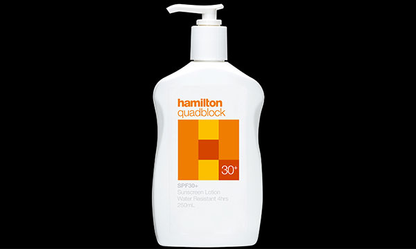
Key Pharmaceuticals Hamilton For over 90 years Hamilton have developed and manufactured sunscreen and skincare products that provide very high protection for Australia’s harsh climatic conditions. Brand and packaging identity for a range of sunscreen products. Key Pharmaceuticals Hamilton For over 90 years Hamilton have developed and manufactured sunscreen and skincare products that provide very […]
Pharmasales
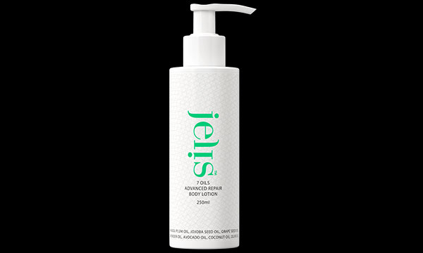
Pharmasales Jelis, eLive and Bundle Pharmasales is dedicated to creating skin and self-care products that combine the power of science with the nurturing properties of natural ingredients, making it easy to incorporate therapeutic pampering into a busy lifestyle. Brand identity’s for Jelis body care range, eLive moisturising gel and gloves, and Bundle pre and […]
USANA

Usana Health Services Inc. USANA In looking at the future, it’s often important to reflect where the organisation has come from. Understanding why the business had begun, its development and the marketplace changes that influenced its history. In determining the direction for the reinvigorated identity programme for the American health services company, numerous starting points […]
Earfit
Nihon Sieber Hegner K.K. Earfit A Japanese manufacturer of a wide range of industrial hearing products. The brand logotype illustrated the effect of diminishing sound while symbolising the product as the ultimate blockage of noise. Nihon Sieber Hegner K.K. Earfit A Japanese manufacturer of a wide range of industrial hearing products. The brand logotype illustrated […]
TangYouGuanJia (Beijing) Retail
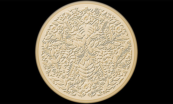
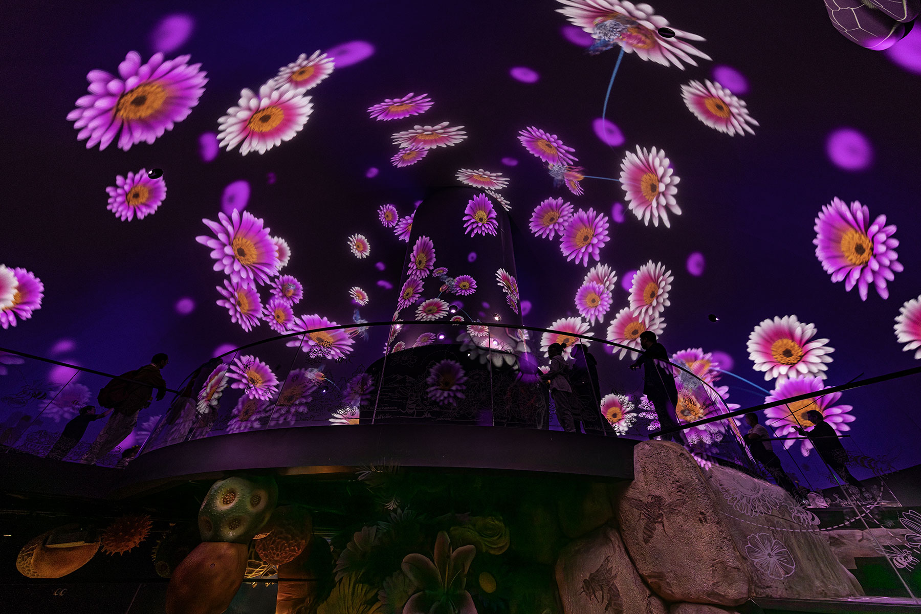
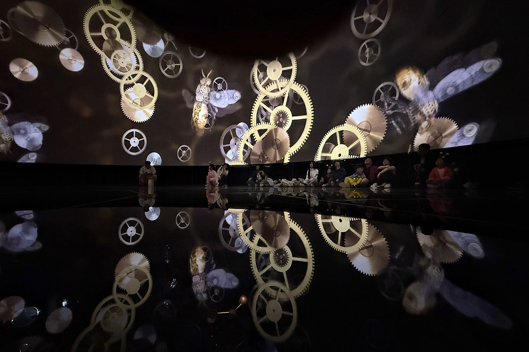
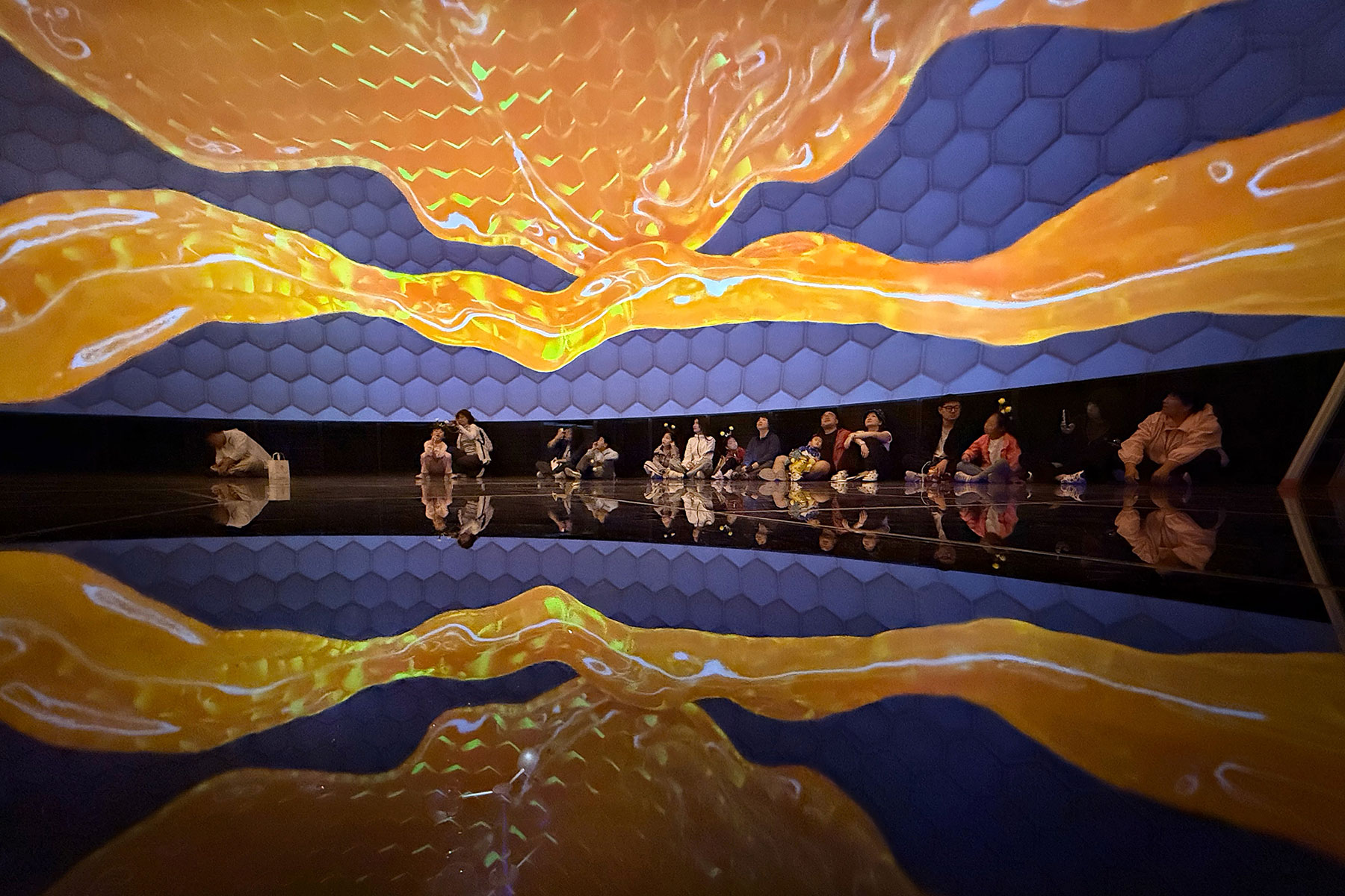
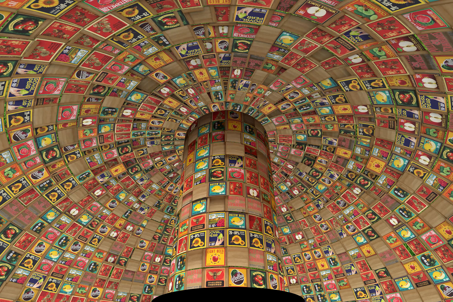
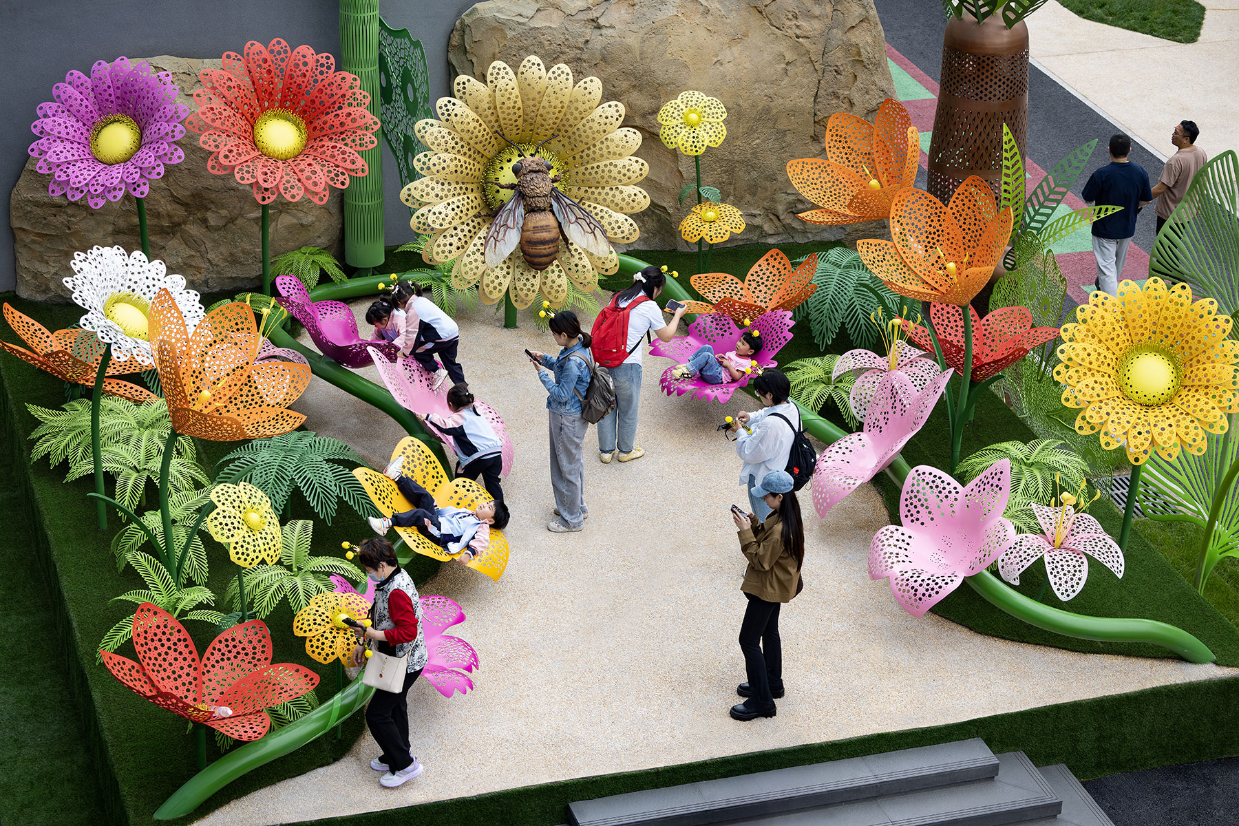
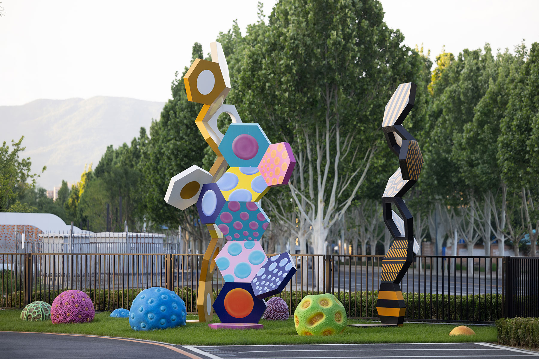
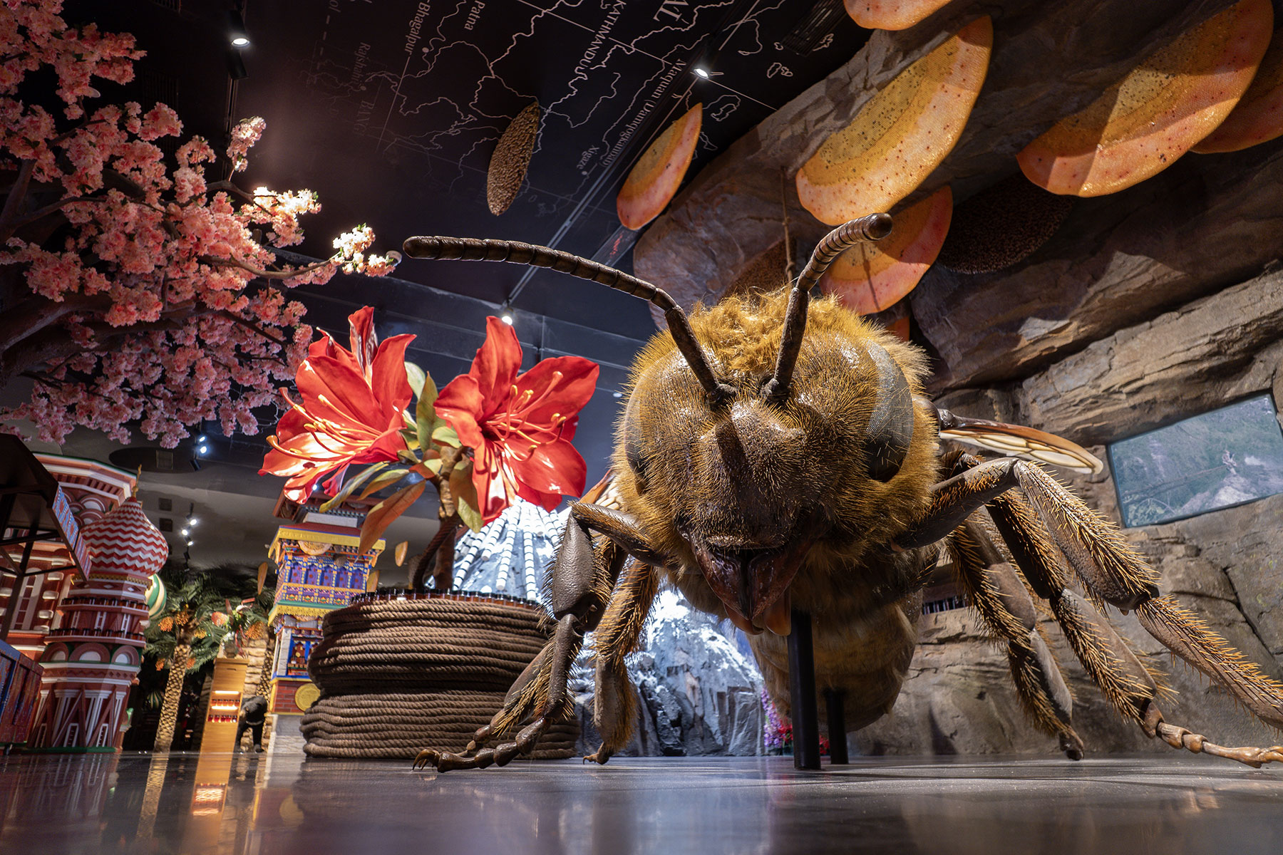
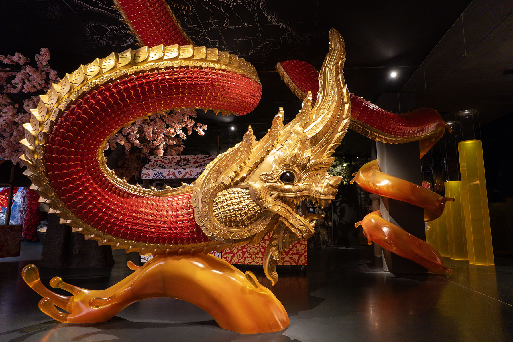
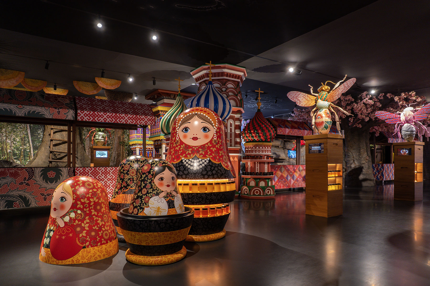
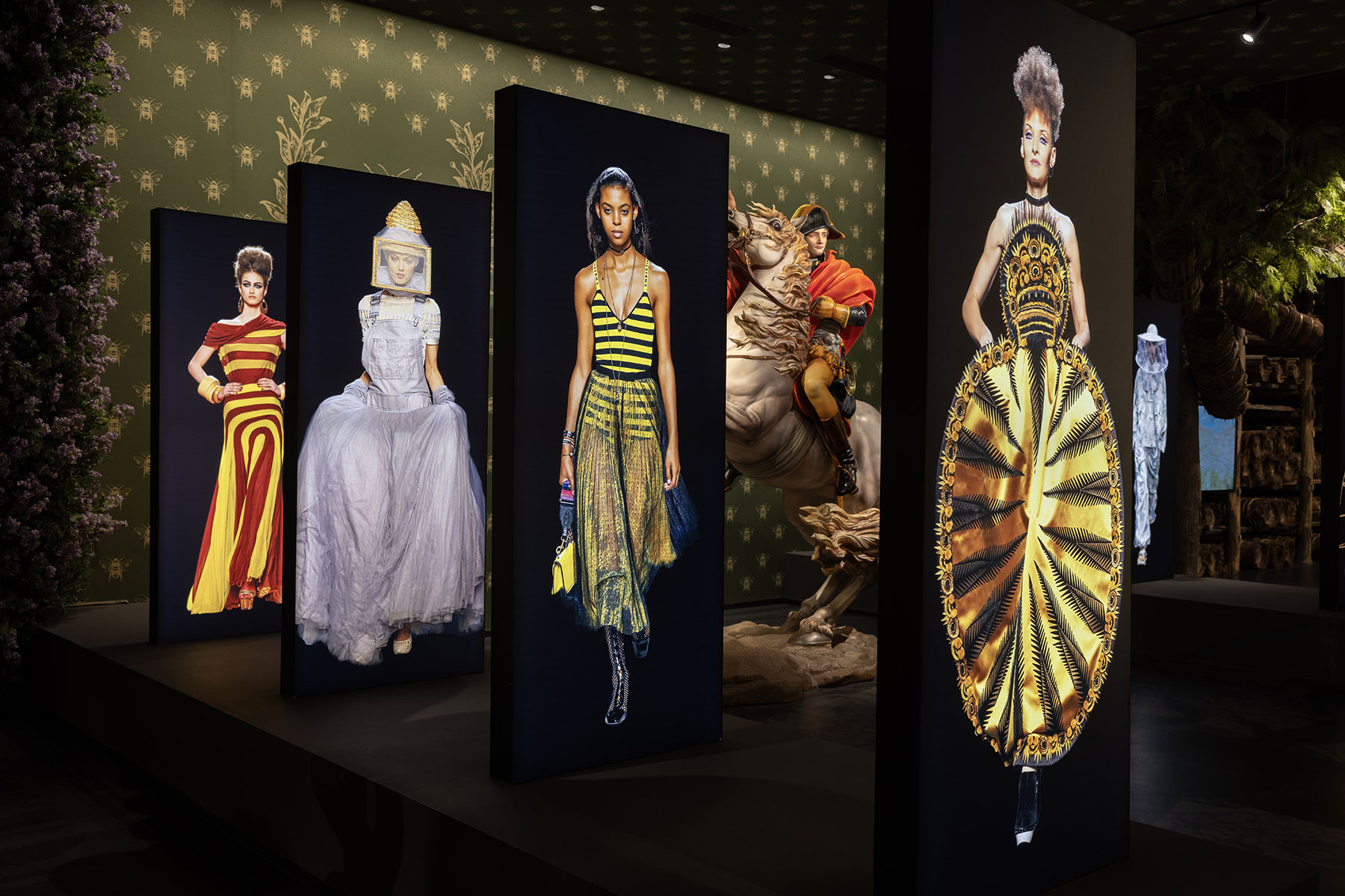
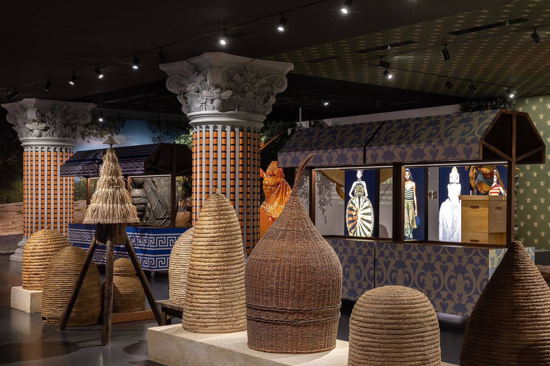
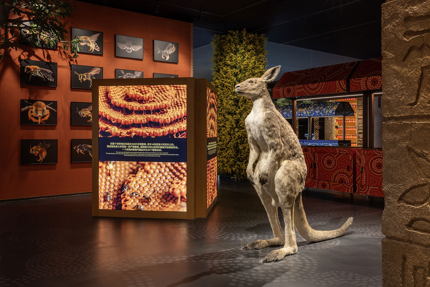
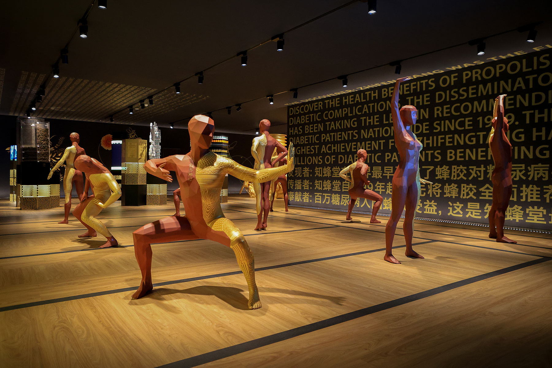
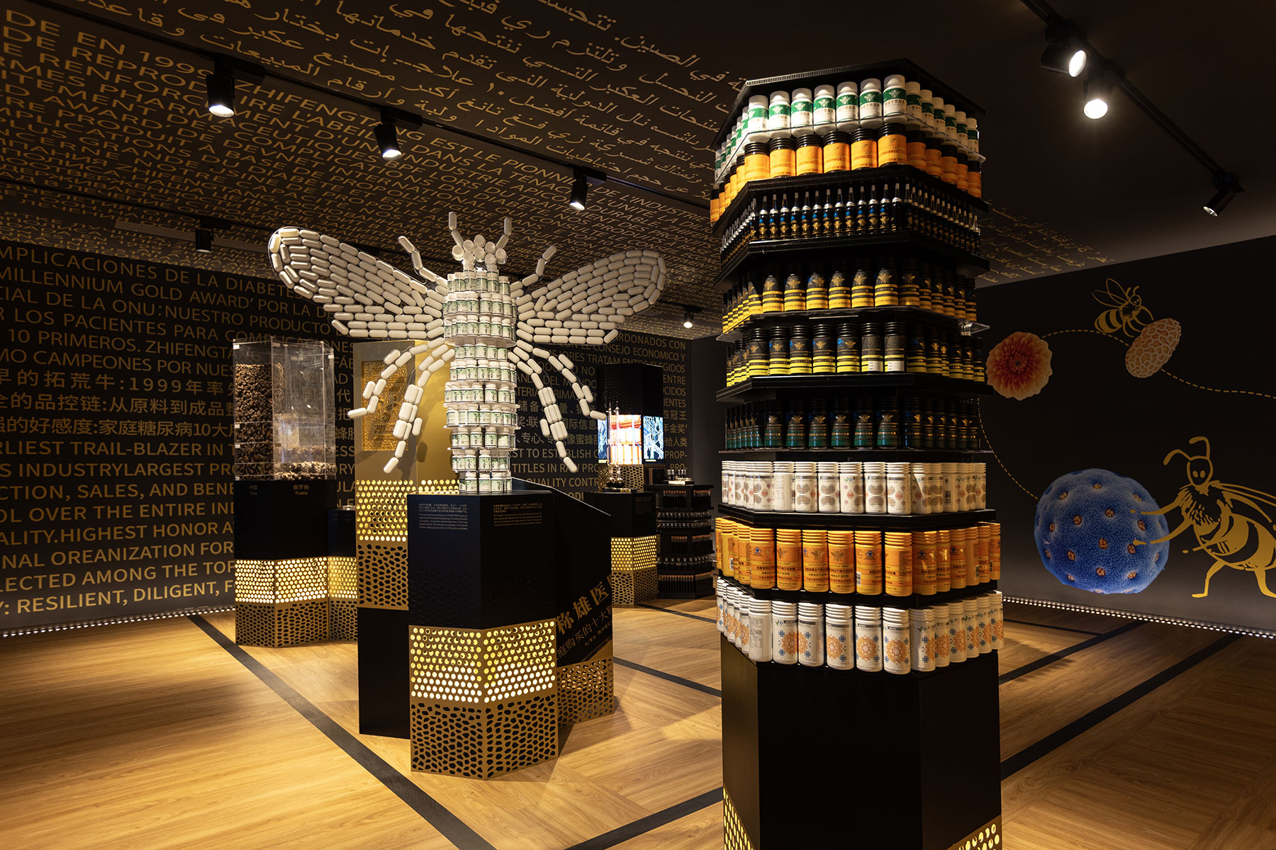
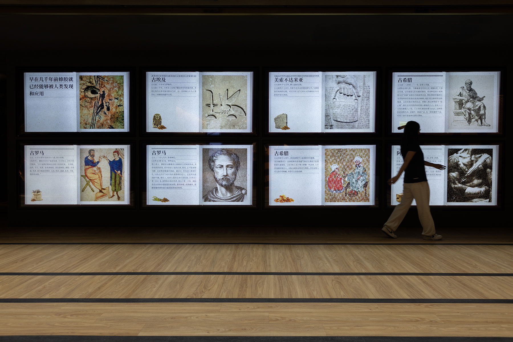
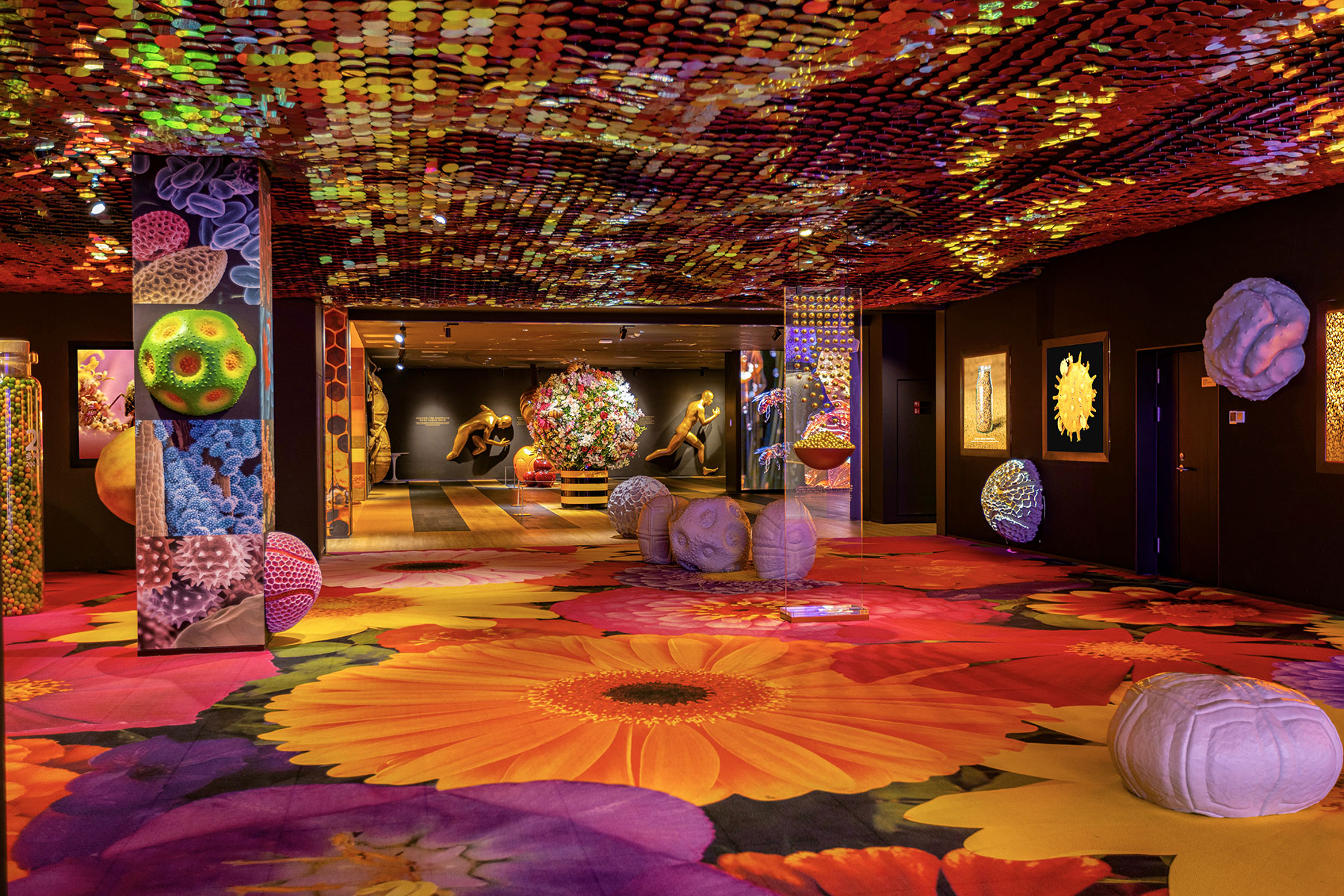
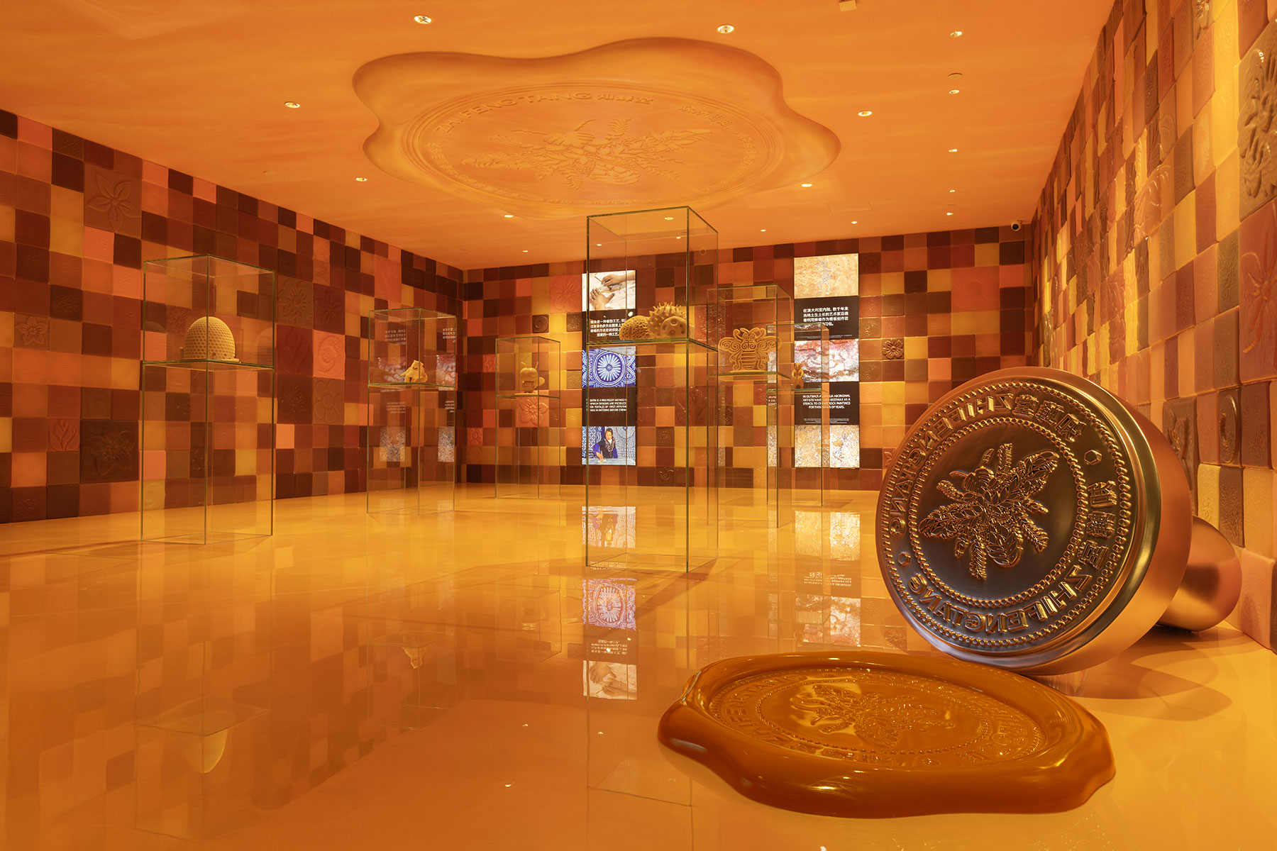
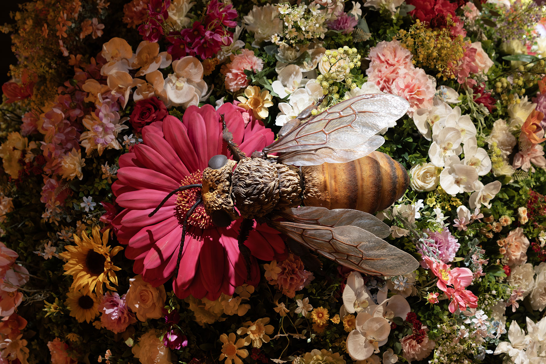
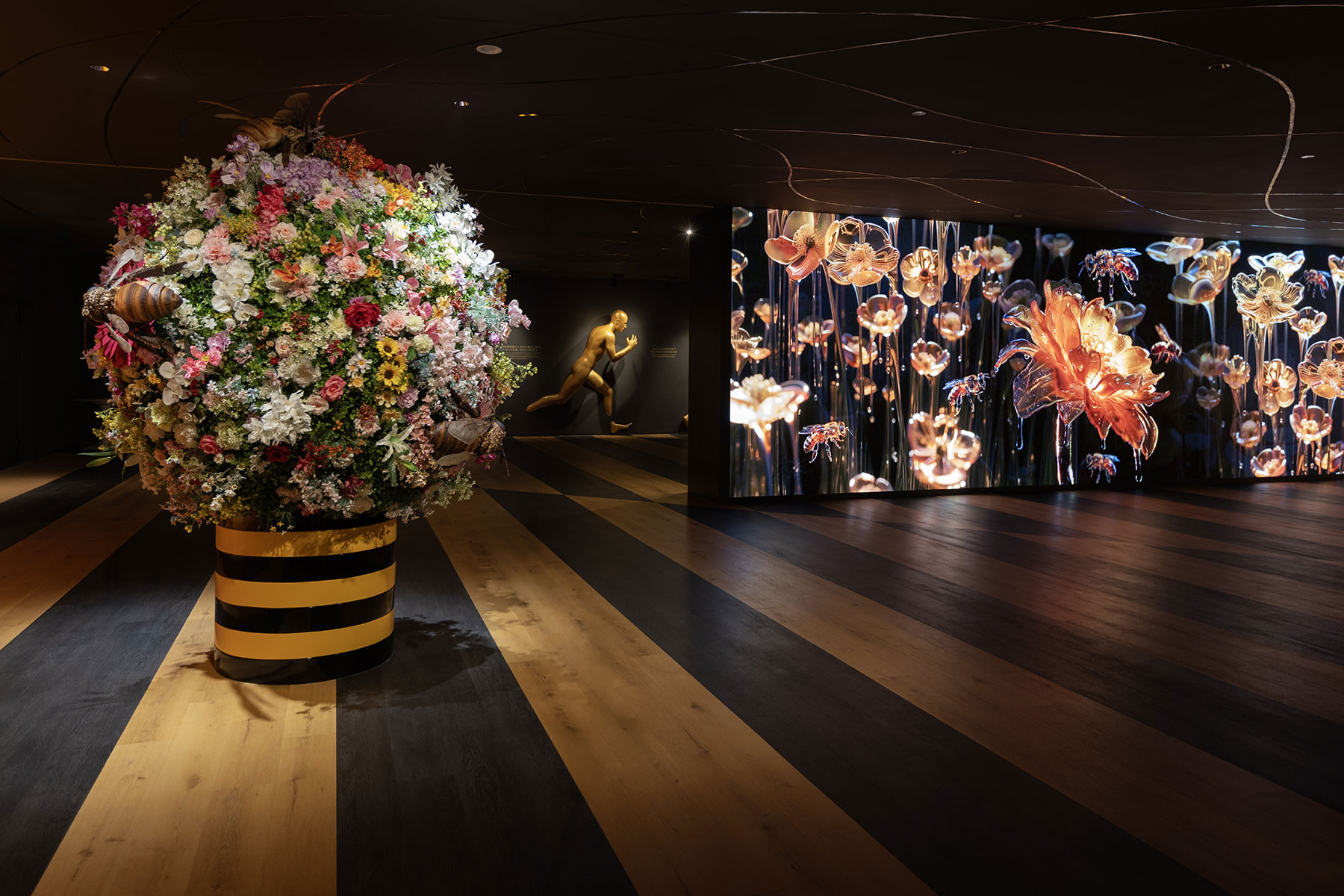
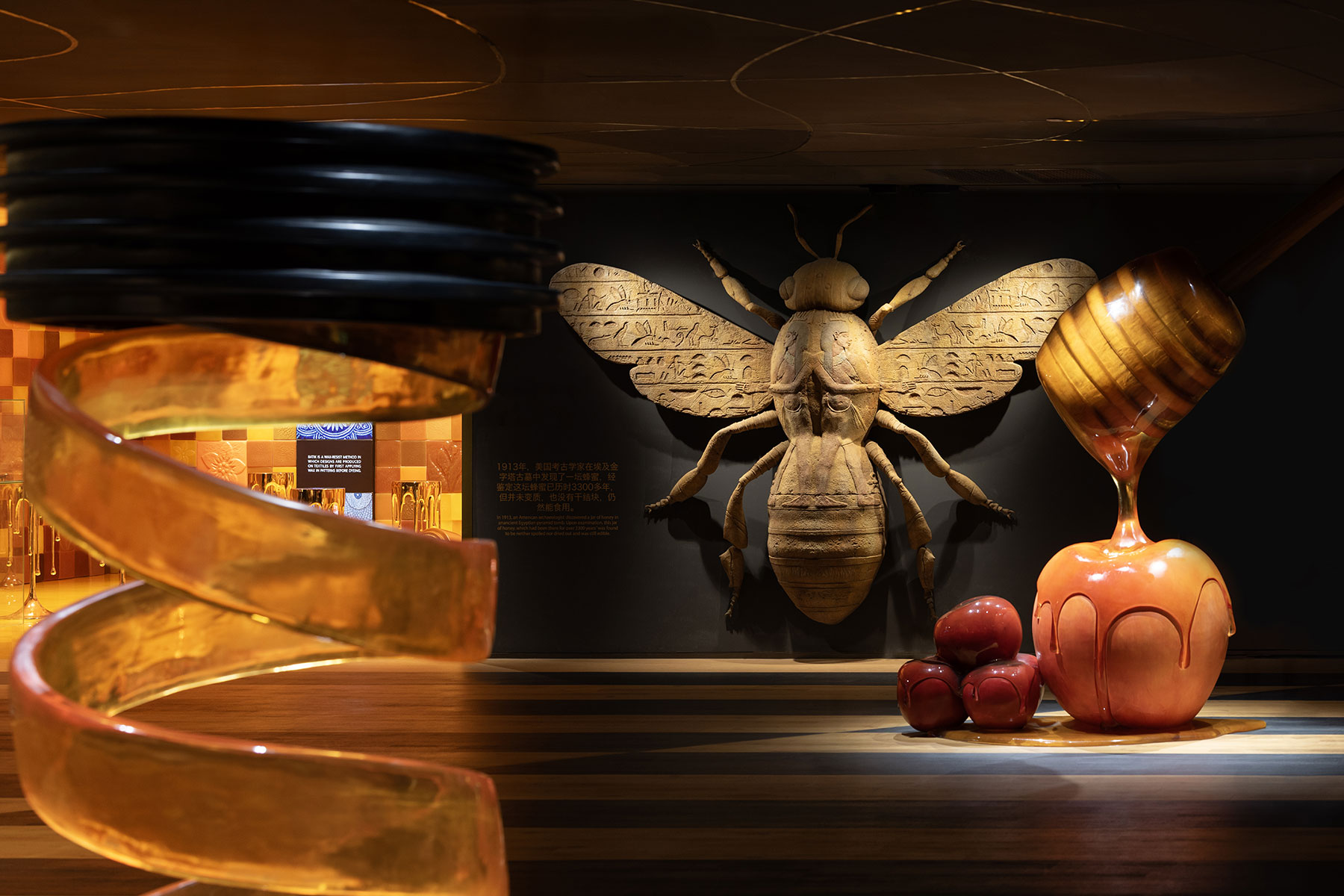
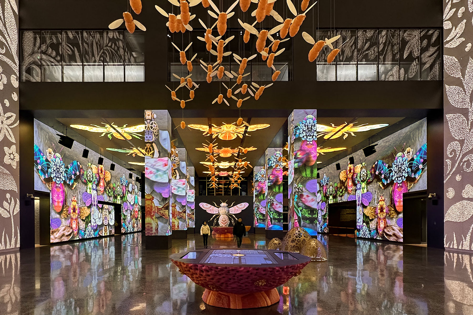
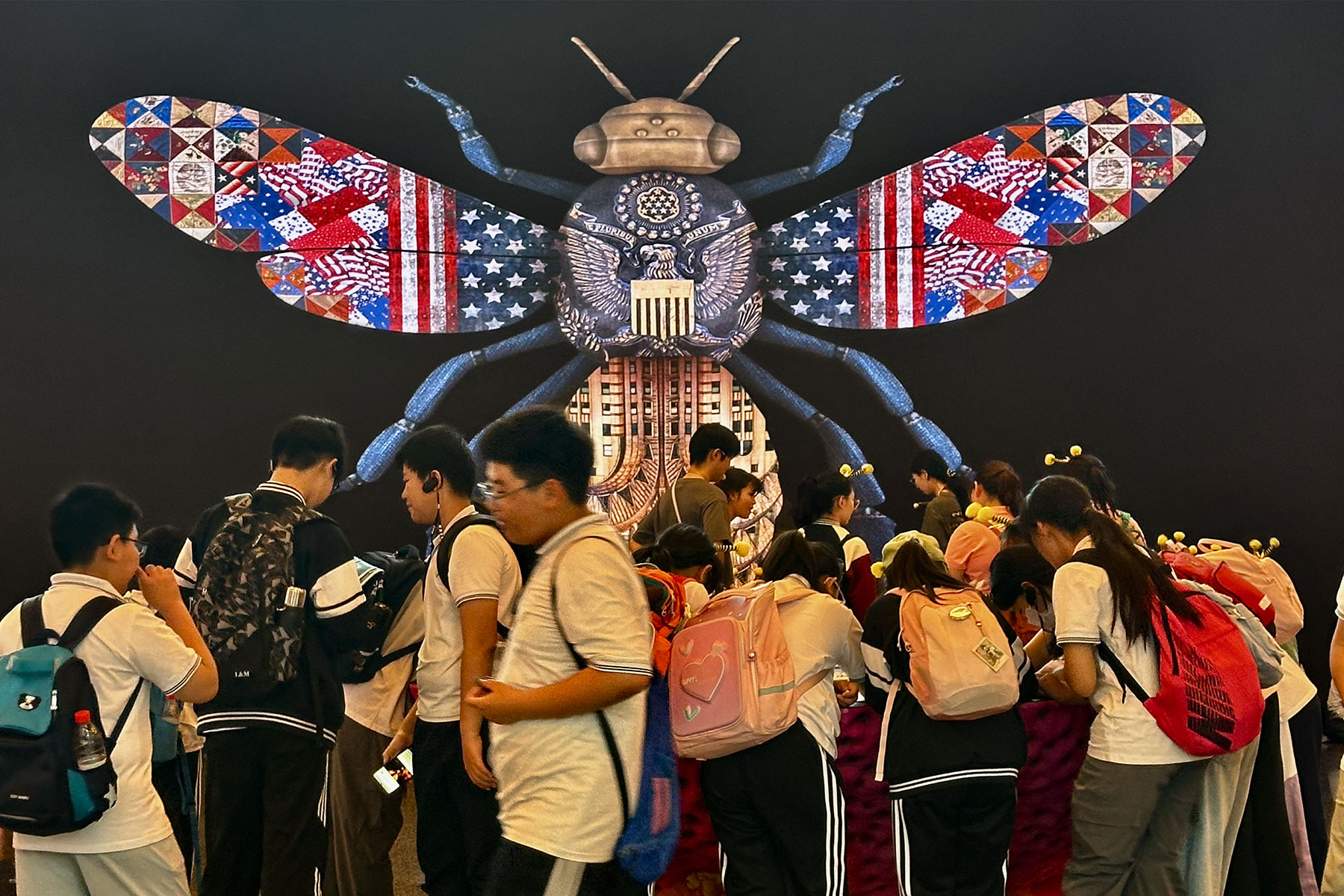
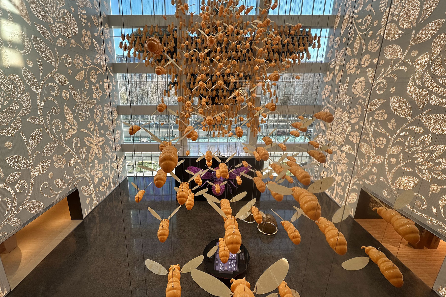
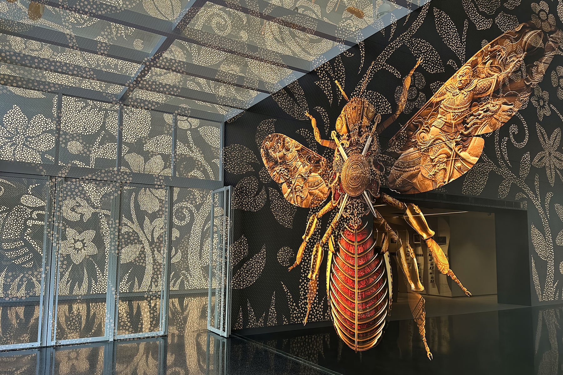
TangYouGuanJia (Beijing) Health ZhiFengTang Development of sub brands and sub brand language for retail products derived from bees. The spirit of the corporate brand was easily adapted for the crystalised honey products. Also, for ZhiFengTang a women’s health care range of products which included specific weight loss product variants. A modified version of the functional […]
Muukiin

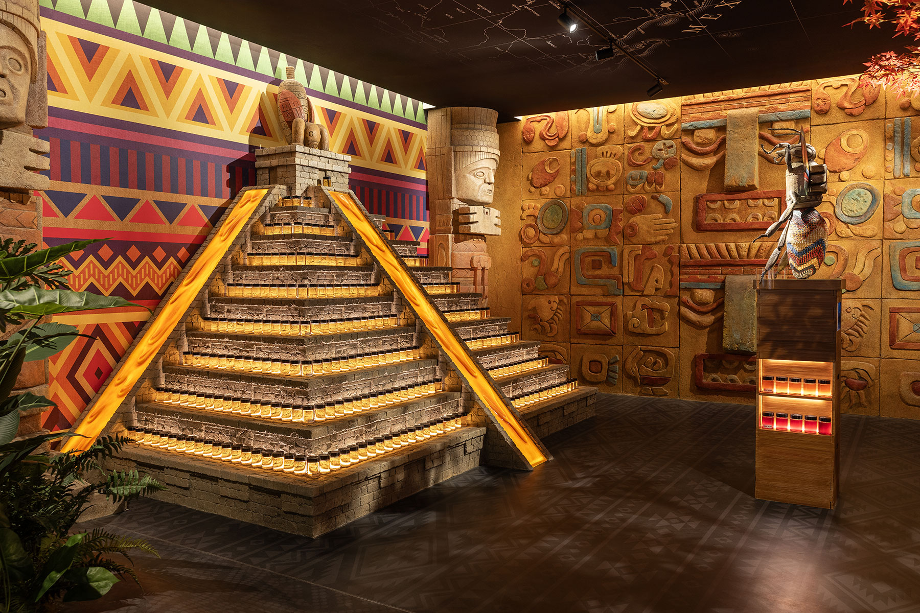
Landsteiner Scientific Muukiin Muukiin was a name developed for a new medical and wellness medicinal cannabis brand for distribution to United States Hispanic communities. The translation of the name was derived from the Mexican Mayan language meaning sun and stamina. The brands development embraced the vibrant colours normally associated with many aspects of Mexican culture […]
TangYouGuanJia (Beijing) Health
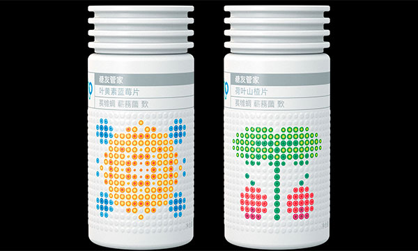
TangYouGuanJia (Beijing) Health China has over half the world’s diabetic population. TYGJ focused its attention in developing products and programmes that would assist those managing the disease. The disease relates heavily to blood cell management which inspired the brand’s supporting graphic language. The cellular language was pivotal in differentiating and communicating the source of products. […]
Guide Dogs Australia
Guide Dogs Australia The Guide Dogs Australia operate as charities in each state of Australia, providing support and services for the vision impaired. By focusing on the central relationship between the guide dog and its owner, the organisations symbol reinforces the idea that the eye of the dog acts as the eye of the owner. […]
agIdeas
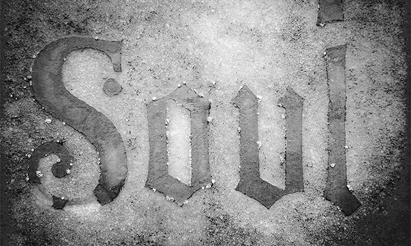
The Design Foundation agIdeas In 1990, what was to become the world’s largest student design conference, was founded in Melbourne, Australia. Over a period of twenty-five years, the conference hosted over six hundred and sixty of the world’s leading designers. Within the conference formats there were a number of specific programmes designed to inform, educate […]
World Vision Australia
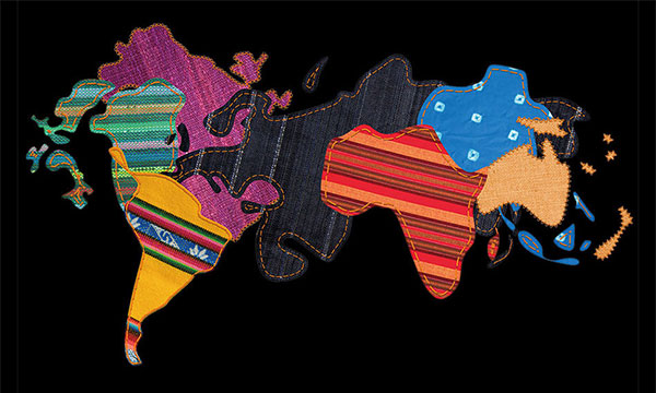
World Vision Australia The established international corporate symbol for World Vision was the only common element in a brand programme that over-arched many project initiatives. The organisation’s own presence was totally diminished in a sea of graphic styles developed for individual fundraising activities. The expenditure of funds may have been effective in achieving some initiatives […]